7 Common Decorating Mistakes That Make Your Home Look Cheap (and How to Fix Them)
We have all seen it. You walk into a room, and something just feels… off. The furniture might be new and the walls freshly painted, but the space feels cheap or unfinished. This is a common frustration for many homeowners. You spend time and money trying to create a beautiful home, but the result falls flat. Often, the problem is not your budget. It is a few simple, common decorating mistakes.
As an interior designer, I can spot these issues from a mile away. The good news is that they are almost all easy to fix. You do not need a massive budget to make your home look expensive and well-designed. You just need to know what to avoid. This guide will walk you through the top 7 mistakes I see and give you the pro-level fixes to solve them.
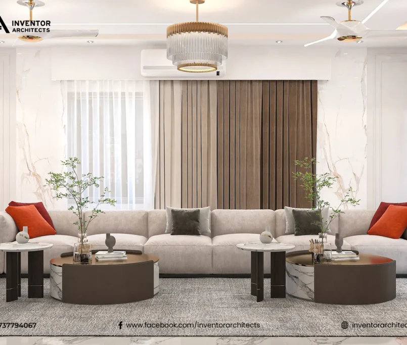
1. The “Too-Small” Rug
A tiny rug floating in the middle of a room is the most common mistake I see. It looks like a postage stamp. A rug is meant to anchor a seating area. It should unify the furniture, not just sit under the coffee table. This instantly makes a space feel small and disconnected.
The fix is simple: go bigger. In a living room interior design, your rug should be large enough so that at least the front legs of all your furniture are sitting on it. This includes the sofa and any accent chairs. This simple change will make your room feel larger, co®rect.
In a bedroom, the rug should extend from under the bed. You should have at least 18-24 inches of soft rug to step onto on either side. A proper-sized rug is a foundation piece. Getting this right is the first step to a professional-looking home interior design.
2. Hanging Curtains Too Low and Too Narrow
Your window treatments have a massive impact on the perceived size of your room. The most frequent error is hanging the curtain rod right above the window frame. This, combined with curtains that are just wide enough to cover the window, makes the window look small and stunts the room’s height.
Here is the professional trick: hang your curtain rod high and wide. You should mount the rod at least 4-6 inches above the window frame. Even better, place it halfway between the top of the frame and the ceiling. This draws the eye up and creates an instant illusion of height.
For width, the rod should extend 6-12 inches on each side of the window. This allows you to pull the curtains back completely, framing the window and letting in maximum light. This also makes the window itself appear much larger. Finally, your curtains should “kiss” the floor. Curtains that are too short look like high-water pants and cheapen the entire room.


The Problem with “Puddling” Curtains
On the flip side, be careful with curtains that are too long. While a slight “puddle” of fabric on the floor can be a deliberate stylistic choice in very formal, traditional interior designs, it is a bad idea for most homes. In a typical apartment interior design in Dhaka, this just looks messy.
Long, puddled curtains are a nightmare to clean. They collect dust, pet hair, and dirt. They also make a space look sloppy and unfinished rather than elegant. For 99% of homes, the most high-end and clean look is to have the curtain hem just skim the floor or hover about half an inch above it.
This precise length shows that the curtains were chosen with care. It demonstrates an attention to detail, which is the true hallmark of a high-end interior design. It is a small detail that makes a world of difference.
3. The “One-Source” Overhead Light
Walking into a room and flipping on a single, harsh overhead light is a design sin. It is what I call “interrogation lighting.” It casts ugly shadows, creates glare, and makes everyone look tired. A room with only one light source always feels flat, cold, and cheap.
A high-end, expensive-looking room always uses layered lighting. This means having at least three types of light: ambient, task, and accent. Ambient is your overhead light. The task is for specific activities, like a desk lamp or under-cabinet lights in a kitchen.
Accent lighting is the “jewelry.” This includes wall sconces, a lamp on a side table, or a light pointing at artwork. By using a mix of lamps and fixtures, you create a warm, inviting, and dynamic atmosphere. You can change the mood of the room instantly. Dimmer switches are also a must-have for a sophisticated feel.
Why You Should Avoid the “Boob Light”
Let’s be specific about that overhead light. The most common culprit is the generic, flush-mount “boob light.” It is the standard-issue fixture in almost every new build and rental apartment. It is cheap, builder-grade, and screams “no effort.”
Swapping out this one fixture is the fastest, highest-impact upgrade you can make. You do not need to spend a fortune. Look for a stylish semi-flush mount light, a modern drum pendant, or even a small chandelier.
This one change elevates the entire room. It shows you have moved beyond the basics. It signals that the space has been thoughtfully designed, not just accepted as-is. This is a secret weapon for making your apartment interior design in Dhaka look custom.
4. Everything is “Matchy-Matchy”
This is a mistake people make when they are afraid of getting it wrong. They go to a furniture store and buy the entire 5-piece matching set. The sofa, loveseat, armchair, coffee table, and side tables all come from the same collection. This is a one-way ticket to a boring, dated, and cheap-looking room.
A high-end home interior design looks like it was curated over time. It has a story. The pieces should coordinate, not match. This means they should share a similar color palette, style, or level of formality, but they should not be identical.
The fix is to break up the set. Keep the sofa, but sell the matching loveseat. Replace it with two accent chairs in a complementary fabric. Get a coffee table made of a different material, like wood or metal, to add texture and contrast. This is how you create a room with personality and depth.
The “Catalog” Look
The “matchy-matchy” mistake creates what we call the “catalog” look. It feels like you just pointed to a page in a catalog and said, “I’ll take that.” It lacks any personal touch or originality. A truly sophisticated space mixes new and old, high and low, soft and hard.
It might have a modern sofa, a vintage trunk as a coffee table, and an industrial metal-framed bookshelf. This mix of textures and styles is what creates visual interest. It is what makes a design feel unique and personal.
This is often where the best interior design company in Dhaka can help. A designer is trained to create this curated mix. They know how to balance a room and pull together different elements to create a cohesive, beautiful whole.
5. Pushing All Furniture Against the Walls
This is a classic rookie mistake, especially in a small living room interior design. The instinct is to push all the furniture against the walls to create a big, open “running track” in the middle of the room. This does not make the room feel bigger. It just makes it feel disconnected and awkward.
Your furniture should be arranged to encourage conversation. This means creating intimate seating groups. You must “float” your furniture. Pull your sofa and chairs away from the walls. Even a few inches can make a huge difference.
This creates “breathing room” and makes the space feel more open. In a larger room, you can float the entire seating group in the middle, anchored by a rug. This creates clear, defined traffic paths around the seating area, not through it.
The “Dead Center”
The result of pushing furniture against the walls is a “dead center.” It is a wasted, empty space that serves no purpose. The only time this layout works is in a very narrow, small room where you have no other choice.
By floating your furniture, you create a more purposeful and welcoming layout. It invites people to sit down and talk. You can place a slim console table behind the sofa. This is a great place for a lamp or some decorative items.
It is a more confident way to design. It shows you understand how to use the space you have. It is a fundamental principle of good interior design that instantly separates a pro look from an amateur one.
6. Using Bad or Mass-Produced “Art”
Art is what gives a home its soul. A common decorating mistake is to use generic, mass-produced art just to fill a blank wall. Think of those “Live, Laugh, Love” signs or a cheap, pixelated canvas print from a big-box store. These items lack personality and can make your home feel generic.
The second mistake is hanging art incorrectly. Art that is hung too high is a classic error. It makes the room feel unbalanced, and the art itself looks like it’s floating away. The same goes for art that is too small for the wall it’s on.
The rule of thumb is simple: hang art at eye level. The center of the piece (or the center of a gallery wall grouping) should be about 57-60 inches from the floor. This is the average human eye level, and it is the standard used by art galleries.
How to Fix Your Art Situation
You do not need to be a millionaire to have great art. Instead of a cheap print, frame something personal. It could be a beautiful piece of fabric, a high-resolution photo you took, or even your child’s drawings in a sophisticated frame.
Visit local art fairs, university art shows, or online print shops. You can buy stunning, original art from emerging artists for a very reasonable price. A single, interesting piece of art is better than a dozen generic ones.
And pay attention to scale. A tiny picture on a large, blank wall looks sad. You either need a much larger piece or you should group several small pieces into a “gallery wall.” Conversely, a huge piece on a tiny sliver of a wall will look cramped.
7. Ignoring the “Clutter” of Everyday Life
You can have the most beautiful home interior design, but if it is covered in “life clutter,” it will always look cheap and messy. This includes piles of mail on the dining table, shoes kicked off by the front door, and a tangle of wires under your TV.
A high-end home looks clean and organized. This is not because the people who live there are magically tidier. It is because their interior design includes solutions for clutter. Good interior design is not just about looking good; it is about functioning well.
You must design storage for the life you actually live. If you always drop your keys on the table, put a beautiful decorative bowl there to catch them. This is what we call “planned clutter.” It is a designated, stylish home for the messy parts of life.
The Magic of Baskets, Trays, and Boxes
This is the easiest fix in the book. Use stylish containment. Get a beautiful woven basket to put by the sofa for your throw blankets. Get a sleek leather tray for the remotes on your coffee table.
For your apartment interior design in Dhaka, this is essential. Use attractive boxes on your bookshelves to hide miscellaneous items. Invest in a good cable management system to hide that “rat’s nest” of wires behind your TV.
This is what creates a calm, uncluttered, and expensive-looking home. It is the final polish. It shows that you have thought about not just the static design, but how you will actually live in the space.


Summary: A High-End Look is in the Details
As you can see, none of these fixes requires a massive budget. They are about making smart, intentional choices. Avoiding these common decorating mistakes is about understanding the principles of good interior design: scale, proportion, lighting, and layout.
By using a properly sized rug, hanging your curtains high, layering your light, and creating curated furniture layouts, you can transform your space. Your home interior design will go from feeling cheap and accidental to looking expensive, custom, and full of personality.
Frequently Asked Questions (FAQ)
1. My living room is very small. Do I still need a large rug?
Yes! This is a common fear, but a large rug actually makes a small room feel bigger. A small rug will visually “chop up” the floor, making it feel even smaller. A larger rug that fills most of the floor area will unify the space and create a more expansive feel.
2. I’m on a tight budget. What is the one thing I should change to make my home look less cheap?
Lighting. Without a doubt. Ditch the single overhead “boob light” and get a stylish new fixture. Then, add at least two lamps (a floor lamp and a table lamp). The warm, layered light will instantly make your space feel cozier, richer, and more expensive.
3. I have an open-plan apartment. How do I stop it from looking cluttered?
In an open-plan apartment interior design in Dhaka, “zoning” and containment are your best friends. Use rugs to define the living and dining areas. Use smart storage, like baskets and trays, to corral everyday items. And use closed cabinets to hide as much as you can.
4. Is gray paint still in style, or will it make my home look dated?
While warm neutrals (like beige, taupe, and “greige”) are becoming more popular, gray is not “out.” It is a timeless neutral. The key is to avoid a cold, flat gray. Look for a gray with warm or complex undertones. More importantly, make sure to pair it with warm textures like wood, leather, and soft fabrics to keep it from feeling sterile.